The Development of a Graphics Design Logo Fail is not the result of a mistake. Even a design fail has purpose and value when seeking out a visual solution for a client. Clients determine what exactly they like and what they don’t. This original background art was selected after reviewing the poster, so the yellow brick road was working for everyone. The logo however was not, so this logo design can only be seen here in this article, in all it’s glory. On display, for me to explain in great detailed how exactly a fail becomes useful for the artwork presentation.
Reviewing Logo Concept Art
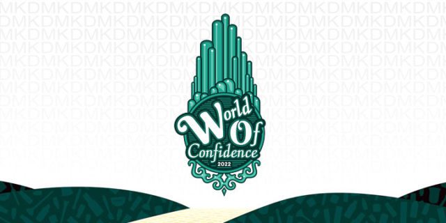
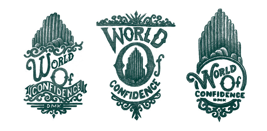
Initially, the event project was introduced as a poster. This large poster for the event needed to be a “Wizard of Oz” themed, touch of “Emerald City” design that may or may not require event merchandise. Also, the attendees could possibly be wearing costumes at the event. So, right from the start “Fun” was a great place to begin creating for this event. Three fun concepts were eventually presented for an event logo, seven were created, but the other 4 were definitely not worth of presenting. Showing appropriate first sketches can assist to inspire a client, presenting unfinished concepts can distract any individual away from what works.
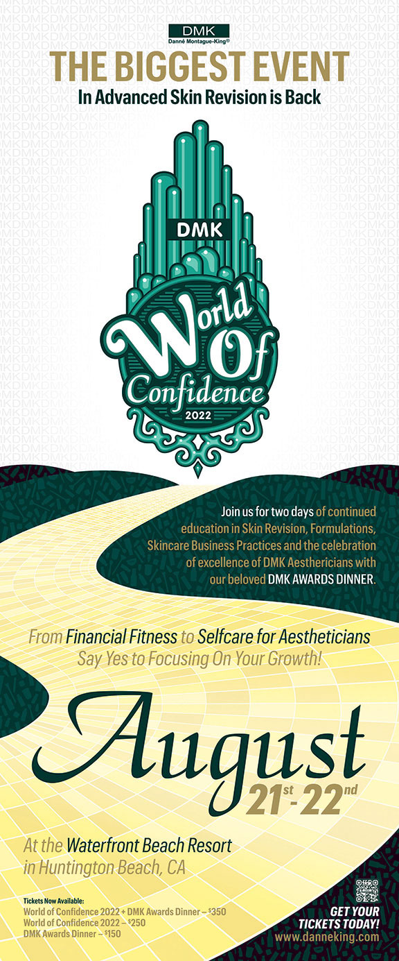
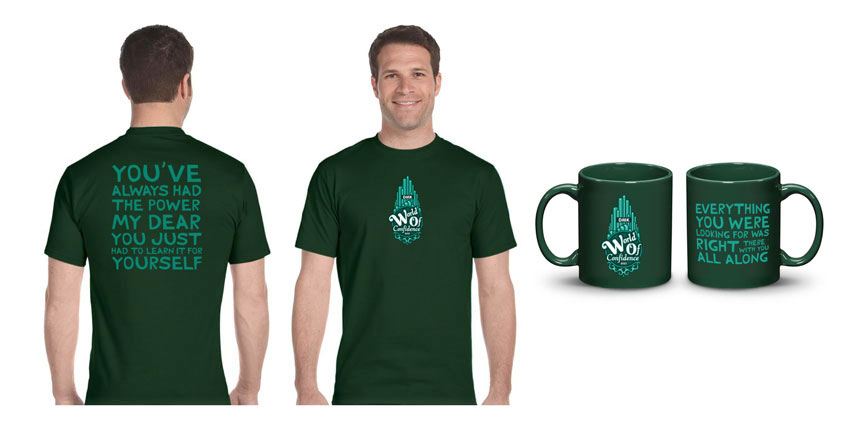
Event merchandise was not planned, although it was a possibility for this event. To have swag, a bag of small items to be made available for each guest was in the minds and thoughts of all involved. Within each bag could be fun gifts and such. Providing t-shirts, a presentation folder and maybe coffee cups was a simple place to start. Forward progress was focused first on the creation of the poster. This is where the background took light, a yellow brick road was created to compliment text for the event, as well as, the iconic logo. The process has a routine flow:
- Original Sketches
- Guide Art Direction
- Focus Revisions
- Final Mechanical Art
Design Fails Are Not Mistakes
Graphic Design fails can result from miscommunications or maybe an attempt to go too big, too soon. These concept ideas are very raw, many are never meant to get past the sketching stage. Intelligent ideas brought to the light and meant to impress, yet sometimes they do not. Sometimes a client simply determines exactly what they don’t like. Directly after looking at the art.
Which Graphics Work Best
Some graphics work better for others, this graphic design logo fail is the direct result of taking an idea all the way to the end, with confidence. Without it, a discovery of what was needed by the client was only an idea, here we have an example of what might work for the client, with changes. The yellow brick road was loved and used for the final poster, but the logo was not so lucky. A simple typography solution was eventually used in the end, an animated character was also added. The project developed in a direction and was finalized. The event product looked fun, but was to never be.
Here at the Chromatic Path we present concept sketches first, pencil on paper to open dialogue with a client. If a client doesn’t like the direction of a design, then he or she can opt-out with minimal expense. Raw ideas usually take only a few hours to express. We present three original ideas, some ideas are not going to work. It happens. It actually helps the process of determining what exactly is desired.