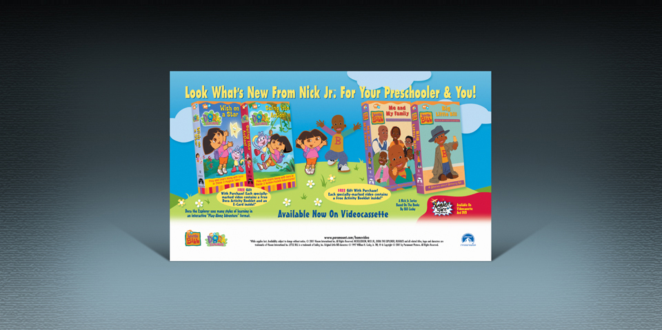
Producing horizontal magazine ad designs for large companies can sometimes be very simple. Multimillion dollar corporations like Paramount and Nickelodeon invest in style guides for each of their products.These are large folders which include branding instructions, pages of rules, CDs, DVDs and strict requirements for developing marketing materials. This is important for managing a brand name as a product’s public appearance must look like an entire matching set. From packaging, clothing, video, print, web and even publications ads – everything must match as a cohesive branded product. This project came with strict instructions and a style guide with CDs of various backgrounds, character poses, fonts and packaging designs all in high resolutions and ready for any kind of product development.

Design:
This horizontal magazine ad was primarily for the release of 4 products, three too many for a half page ad but that wasn’t important as the client specifically requested that each product be present in the design. With everything we needed provided on disc within the “Style Guide” it laid out itself. Three design concepts were presented for review, the final art was honestly the only solution that was presentable yet every client deserves choices. Design choices assist with communication when someone has an idea that they know will work and when they see it realize that it most definitely doesn’t. Seeing is not only believing it’s understanding a situation that might be difficult to visualize. Fitting 4 products into one ad required great communication, compromise and understanding from everyone involved.
Production:
High resolution production was relatively quick and simple. When corporations invest in “Style Guides” they not only protect the integrity of their product’s brand name, they make it very easy to stick to that guide by providing the digital files needed to produce materials like horizontal magazine ad designs in an efficient manor. The background was the only item that is completely original – in needed to provide the open space for 4 products, plenty of text, plus it had to match the artwork within the provided style guide.
What was included:
• Research (2 hours)
• 3 Concept sketches (3 hours)
• 3 Low resolution color designs (6.25 hours)
• Photoshop image clipping (1.75 hours)
• Photoshop background creation (2.25 hours)
• High resolution graphic production (3.50 hours)
• 5 Text revisions (1.25 hours)

