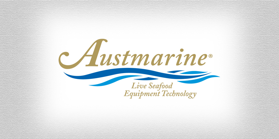
When an industrial manufacturer decides to develop a product line for the general public, they are going to need a product logo with a touch of class. Since this logo was to be placed not only on brochures and a product box, but the actual glass of the seafood tank – it needed to be universal and most of all prestigious. A logo on glass is a bit tricky, because it will reflect light, while at the same time be lost through the translucency of the glass. The final logo that you see above is a digital representation, but the actual final was produced with a gold like foil giving the impression of actual gold and reflecting light much like gold really does. This made sure that the logo looked fantastic on everything and was visible when placed directly on glass.

Design:
Two hours of research time was spent on the seafood tank industry and what could be done when labeling a glass product. Six hours were spent drawing sketches on paper to determine what kind of a logo would look best. Twelve concept sketches were presented and the final that you see above was the most impressive. The use of gold was a winning concept for everyone involved, the idea of being a foiled ink was the cherry on top.
Production:
After the concept sketch was approved, the final illustration process began. Normally, the rule when coloring a logo is to keep the amount of colors low – 3 is good, 4 is a bit much, and anything over that amount is considered too many colors. Since the bulk of this project was research and design, the final illustration of the approved concept was quick and easy.
What was included:
• Research (2 hours)
• 12 Concept sketches (8 hours)
• 3 Text treatment designs (1.5 hours)
• 3 color presentations (.50 hours)
• One high resolution illustration (1 hour)
• Final hi-res logo EPS and AI vector files

